Squarespace Linear Gradient Backgrounds Ultimate Guide [2025]
Adding gradients to your Squarespace site is a simple yet powerful way to enhance your design and make it visually appealing. From linear gradients to multi-color and transparent effects, gradients allow you to add depth and creativity to your sections. With just a few tweaks to the CSS, you can customize the direction, angles, and even create repeating patterns. It’s an effective way to give your site a modern and dynamic look!
Let’s dive in..
Watch the video
Check out the YouTube video below 👇
Navigate to your Squarespace dashboard and go to the 'Website Tools' section. Next, click on 'Custom CSS'. It should look like this:

Next, copy and paste this code into the custom CSS section, as shown in the image below.
section[data-section-id="YOUR ID” ]
.section-background {
background: linear-gradient(#00FF00, #0000FF);
}

To easily identify your Squarespace section ID, I recommend using the Squarespace ID Finder Chrome extension. With a simple click on the extension, the section ID will appear. You can easily download it by visiting the Chrome Extension Store and searching for 'Squarespace ID Finder,' or by simply looking it up on Google.

Next, replace 'YOUR ID' with your Squarespace section ID, and voilà! You’ll have a beautiful linear gradient background on your Squarespace site. But that’s not all—there are many more styles you can explore. Check out some examples below!

Direction: Top to Bottom – This is the same as shown in this tutorial. Code:
section[data-section-id="YOUR ID"]
.section-background {
background: linear-gradient(#00FF00, #0000FF); /*CHANGE THIS COLOR TO WHAT YOU WANT */
}

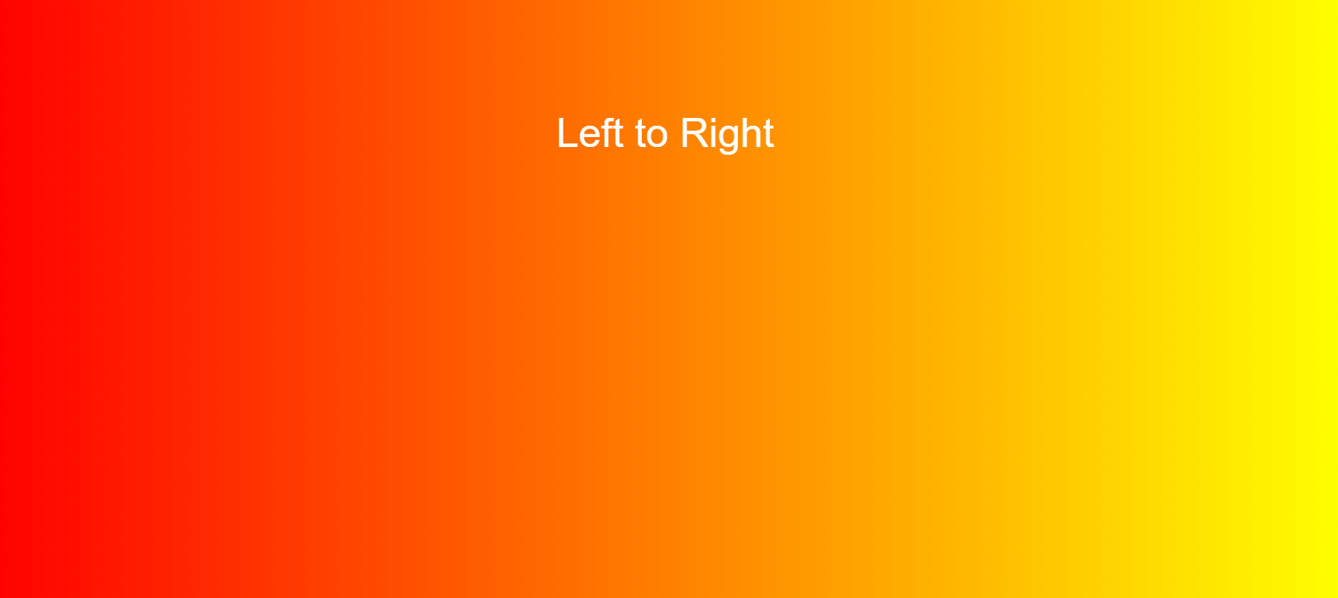
Direction: Left to Right – Use the following code to achieve this gradient:
section[data-section-id="YOUR ID "]
.section-background {
background: linear-gradient(to right, #FF0000, #FFFF00); /*CHANGE THIS COLOR TO WHAT YOU WANT */
}
Direction: Diagonal – Use the following code to create a diagonal gradient:
section[data-section-id="YOUR ID"]
.section-background {
background: linear-gradient(to bottom right, #2193b0 , #FFFF00); /*CHANGE THIS COLOR TO WHAT YOU WANT */
}

Using Angles: This example uses 45deg, but you can adjust it to any angle you want the gradient to start from. Code to achieve this:
section[data-section-id="YOUR ID"]
.section-background {
background: linear-gradient(45deg, #cc2b5e , #753a88); /*CHANGE THIS COLOR TO WHAT YOU WANT */
}

Multiple Colors: Use the following code to create a gradient with multiple colors:
section[data-section-id="YOUR ID"]
.section-background {
background: linear-gradient(#bdc3c7 , #2c3e50, #de6262 ); /*CHANGE THIS COLOR TO WHAT YOU WANT */
}
Note: You can combine all the other metrics mentioned above, such as left to right, specific angles, and more, to achieve these effects with multiple colors.

Transparency: This gradient transitions from a color to a transparent color—for example, red to transparent in this case. You can use this effect over a different background to make it blend seamlessly. The code to achieve this:
section[data-section-id="YOUR ID“]
.section-background {
background: linear-gradient(to right, rgba(255, 0, 0, 0), rgba(255, 0, 0, 1)); /* You can change direction here and Colors */
}

And now, the one you’ve all been waiting for... Okay, maybe not, but seriously—Repeating a linear gradient. Use the following code to achieve this effect:
section[data-section-id="YOUR ID"]
.section-background {
background: repeating-linear-gradient(red, yellow 10%, green 20%); /* We specify of how much each color should weigh - you can also use
*/

Your designer
I'm Victor Rolf, an expert Squarespace designer .If you'd like to discuss a potential project, you can email me at victor@rolfmade.com or get in touch here. Alternatively, book a free 15-minute consultation call here.